Tuesday, February 2, 2010

Type Terminology Part 3

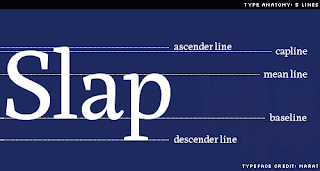
An invisible grid of parallel horizontal lines is used as a constant reference in the creation of a font. It resembles a musical score and its four (or five) horizontal lines represent, from top to bottom, the ascender line (the height of the highest ascender), which is sometimes equivalent to and sometimes higher than the ascent or capline (the height of the capital letters). Next comes the meanline or waist line (the height of a lowercase x), which can be referred to as a high waist line or a low waist line; the baseline (on which the letters appear to rest); and finally, at the very bottom, the descent, descender or beard line (the level to which the lowest descenders descend).


Ascenders are the parts of some lowercase letters that rise above the meanline, and descenders are, conversely, the parts of some lowercase letters that fall below the baseline. The ascenders and descenders of a given typeface may be described as long, normal or short. There are a number of self-descriptive terms for the relative distances between the lines on this typographic grid, such as the p height, the k height, the H height or cap height, and, most famously, the x height or body of a typeface.

The lowercase letters, which, like the x, have no ascenders or descenders, are known as the primary letters. The uppercase or capital letters are the 23 capitalis monumentalis invented by the Romans, plus three characters that were added to the alphabet later: U and W, about a thousand years ago, and just 500 years ago our youngest letter, J was born.

"I look for unevenness, for letters that are over- or under-weight, for any inconsistencies that might flag the flavor. Every letter must be independently legible so that if it is seen out of context it will not be misread. Finally the entire alphabet must be ‘in tune’….
The oboe is the first instrument you hear when a symphony orchestra begins to ‘tune up.’ The oboe gives the pitch. It has great penetration and can easily be heard by all the other instruments. Now comes a surprising coincidence: the letters O B E in the word OBOE and the lowercase letters o b e—or preferably o d e—are, by the nature of their design, key letters that give the pitch to which other letters of the alphabet may be tuned. O B E and o d e carry a big load in determining the character of a style. They are not dramatic shapes like a or g or s, but they sound the pitch clearly. First they must be in tune with each other, then the remaining letters should be in design harmony or in artistic balance with these three. All must be in tune.”
—Edward Rondthaler, Life with Letters, as they turned photogenic, 1981.

When creating a new typeface, type designers sometimes look at particularly revealing words to test the look of the letters in sequence. These are known as key words, trial words, test terms, and sometimes simply as proof. The word Slang, for instance, contains an uppercase letter, lowercase letters, an ascender, a descender, round letters and straight letters. The aforementioned Oboe is a key word; some other popular trial words are Champion, Hamburgevons, Hamburgefonts and even, for those who really want to study their emerging typeface, Hamburgefontsiv.

A set of fonts that are designed to appear related, but with contrasting proportions and weights, is known as a family. A type set is a complete set of letters, sometimes, but not always, including both uppercase and lowercase characters and basic punctuation. A type set is also known as a font. An advanced type set, which typically include alternate characters such as swash letters, once very popular in book and movie titles, is known as an expert set. Expert sets often contain alternate characters and small capitals or small caps, are often used for the first few words of an opening paragraph.
Typographic Color

"The praises of the discoverer of the ‘black art’ continue to be sung right up to the present time. Mark Twain for instance says that the whole world acknowledges without hesitation that Gutenberg’s discovery was the greatest event known to man."
—Albert Kapr, The Art of Lettering; The History, Anatomy, and Aesthetics of the Roman Letter Forms, 1983.

When typographers mention to color, they are typically not referring to a rainbow. They are speaking, instead, of black and white and the wide range of grey textures which are called forth when white and black interact. Every typeface has its own apparent lightness or darkness, or optical weight. Arranged as they might fall along an imaginary grey scale, some of the terms used to describe a type’s color are, from darkest to lightest: black, ultra bold, extra bold, bold, demi or demi bold, medium, book, lightface, and hairline. As the great Swiss typographer Emil Ruder put it in 1960, “The business of typography is a continual weighing up of white and black, which requires a thorough knowledge of the laws governing optical values.”

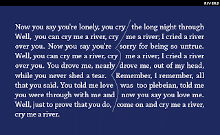
According to tradition, the ideal typographic color for a block of text is an even grey that can be better seen when you slightly squint your eyes at a page of type. Rivers are vertical ribbons of white space that sometimes appear by happenstance in a column of type. To the most sensitive typographers, rivers are like fingernails on a blackboard. They are most common in newspapers, which tend to have narrow columns and tight deadlines. The problem with rivers is that they draw your attention away from the text that you were trying to read.


A bad break refers to an awkward typographic situation which might distract a reader from a typeset text. Typographers take bad breaks very seriously and have given them appropriately tragic names. A widow occurs when a short word at the end of a paragraph is left alone on a single line, thus awkwardly breaking the column of type. When this lone word occurs at the top of the next column, the poor thing is called an orphan. Typographers and graphic designers blithely toss some other startling words, referring to the bleed (images or text which run off the edge of a page), a full bleed (a bleed on all four sides of a page), and the often gleefully spoken kill, which denotes the power to delete unwanted copy from the design.
White Space

Among graphic designers and typographers there is an extensive vocabulary for describing white space or negative space, the unprinted area of a printed piece. This terminology includes the margin (the space around a column of text), which might be a head margin (above the text), a foot margin (below the text), a side margin (towards the edge of a book or magazine), or a gutter or alley (the space toward the page fold, or between columns of text). Reversed type or knock-out type is type that is not actually printed, but is revealed, in the color of the printed surface, by the ink that surrounds it. Open matter refers to text, such as pull-out quotes (also known as lead-ins, extracts, or callouts) that is set with abundant linespacing or many short lines.

The white space between lines of text type is known as leading, and is quantifiable in points. The term comes from the strips of soft metal, which were once placed snugly between rows of metal type. These strips of leading were lower than the type itself, and so did not print. Today leading is also referred to as linespacing, interline spacing, linefeed, or interlinear space (a term preferred by many authors). Lines of type with no leading are said to be set solid. These days, leading refers to the distance between baselines. Negative linespacing or reverse leading is now possible with digital type, but is never good for extended text, as the ascenders and descenders collide.


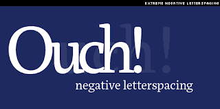
Every typographer knows that it is the space around and between the letters that defines the letters. This interletter spacing, letter spacing, letterspacing or tracking, as it is variously known, can be described as loose, normal, tight, very tight, kissing (the super-tight spacing popular in the 1970s), touching, and there is even a term for the step beyond: negative letterspacing.


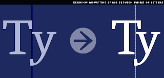
When characters that should not touch each other, do, this is known as a crash. When the space between pairs of letters is fine tuned by the typesetter, this is known as kerning. Kerning includes the adjustment of space known as white space reduction, which is also known as dovetailing, notching or undercutting. But kerning can also refer to an expansion of space, as when kerning to correct a crash.


The space between words is known as interword separation, interword spacing, word spacing or wordspacing, and can be described as loose, normal or tight. There are also specific blank spaces that relate to the size of the type. The em space, mutton or mutton quad is the width of a capital M, the en space, also known as half an em or a nut, is half that width.

In the days of metal type, the em space and en space were supplemented by even smaller spaces, such as the 3-em or 3-to-the-em space, a third of the width of an em space, the 4-em or midspace, one quarter of the width of an em space, and the 5-em space, or 5-to-the-em space, one fifth of the width of an em space. Nowadays, graphic designers tend to refer to the smaller spaces as, in order of their decreasing widths, a flush space, a thin space and the tiny hair space. Other spaces worth noting are the nonbreaking space, which refuses to be hyphenated, the figure space, the width of a monospaced number, and a punctuation space, the width of the simplest punctuation marks.
Tuesday, January 19, 2010

Type Terminology Part 2

Anatomy of a Letterform

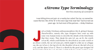
“I was killing time and pain at a nearby bar called The Ear, so named because the two ribs of the ‘B’ in the neon sign that read ‘Bar’ had burned out years ago. So had most of the patrons.”—Kinky Friedman, Blast From the Past, 1998.

Just as Kinky Friedman anthropomorphizes this B, giving it human characteristics, namely ribs, type designers have come up with some very human terms to describe the details of the letterforms that they create. They speak the arm (of, say, an E), the crotch (of an M), which could further be described as an acute crotch or an obtuse crotch, the ear (of some g’s), which might be a flat ear or a floppy ear, the eye (of an e), the leg (of a k), the shoulder (of an n), the tail (of a j or a Q), and the spine (of an S). There is a sketch by the great type designer Ed Benguiat that labels the curl, the lobe and the ball of a single question mark.


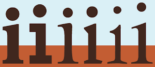
Typically, the point which rests under a question mark or hovers over a lowercase i or a j is called a dot, and the etymology of the word reveals another anthropomorphism: at one time the word dot referred explicitly to the head of a boil or pimple. The dot is also sometimes quaintly referred to as a jot (from the Greek iota) or a tittle (from the Latin titulus).

Nature is recalled in a few terms, such as the stem, the arc of the stem (otherwise known as the shoulder), and the splayed stem. And this is not surprising; an organic sense of life separated the Roman alphabet from the geometric Greek characters that originally inspired it.

Architecturalisms, borrowed from the language of architecture and design, are also common. And why shouldn’t they be? After all, nothing resembles a Roman monument more than the Roman M, especially one with serifs. And the second character in the Phoenician alphabet, beth, which evolved into the Greek beta and the Roman b, comes from the Phoenician word for “house”. Even today, a capital B, if turned counter-clockwise 90°, as the Phoenicians oriented it, resembles a building.


Some of these architecturalisms are the aperture (of a c), apex (of an A), axis or stress (most obvious in an O), the ball (at the bottom of a question mark), the bar, crossbar, or cross beam (of an H), the bowl (of a p or b), counter (of an a or b), flag (a flourished stroke common in black letter type), the hook or finial (of some t’s), inlines (which resemble carved strokes inside the lines), ink traps (notches created to prevent ink bleeds at predictable points on the letter), the joint or juncture (of an R or a Y), the link and the loop (of a g), the spur (of many G’s), the stroke (the main lines of a letter), swash (an exaggerated stroke), swing (the diagonal link of some g’s), and the vertex (of, say, a V).


An experienced typophile can also distinguish between, and speak of, a descended or base-lined J, a one-story or a two-story g, a crossed, joined or rounded W, and even a round as opposed to a super ellipse or obround (elongated with straight sections) O. Even as seemingly simple a thing as a terminal, the end of a non-seriffed stroke, can be characterized as an acute terminal, a ball terminal, a beak terminal, concave, convex, flared, hooked, horizontal, lachrymal (or teardrop) painted, rounded, sheared, straight, or a tapered, terminal.

Serifs were forever defined for me as ‘the little feet on the letters’ by my first type teacher, P. Lyn Middleton. The classification of the innumerable variations in type design that exist today begins with the existence or non-existence of these little feet, which have existed as a crucial detail on most Roman letterforms for a little over 2000 years. Curiously the word itself has a short history. It was probably a back formation from the word sans-serif, which first appears in print in 1830, when typefounder (a designer and producer of metal types) Vincent Figgins published his Specimens of Printing Type. Sans, a French word forever, has been an English word since Middle English times:

“… Last scene of all,
That ends this strange eventful history,
Is second childishness and mere oblivion,
Sans teeth, sans eyes, sans taste, sans everything.”

—William Shakespeare, As You Like It, 1599 or early 1600.

The French sounding serif may have come from the Dutch schreef, “a line” or “a stroke”, from schrijven “to write”, and from the Latin scribere. Type without serifs occurred in Roman times, but it was rare and is seldom seen. In the early nineteenth century sans serif typefaces re-emerged, perhaps as an evolutionary branch away from the Egyptian or slab-serif fonts that were popular at the time. (The fat slab serifs may have become so ungainly that someone at a type foundry, where new letters were carved from steel, decided to simply and literally chop them off.) At first these new letters were described as grotesque or grotesk types, perhaps because they seemed incomplete and ugly, and these terms are still among those used to describe sans serifs today.


The French, meanwhile, tended to use the word antique to refer to sans-serif type, and this word has found its way into English, in, for example, the typeface name Antique Olive. The word gothic is also sometimes used to describe a sans serif, and the terms Gothic and Doric, with capital letters, are now used to refer to the square-stroked sans serif variations of Japanese characters.

Sans serif type faces vary tremendously, and are further categorized as geometric (for example, Futura), monoline (Akzidenz Grotesk), rounded (Frankfurter), humanist (Gill Sans) and neo grotesque (Helvetica).

Broadly speaking, there are two styles of serifs, unilateral serifs, which break from the stem in only one direction, and the more common bilateral serifs, which break from the stem in two directions. These can be further characterized by a surprising number of terms: type designers speak of abrupt serifs (that break abruptly from the stem at an angle), adnate serifs (which emerge from the stem gradually and more organically), bifircated serifs (which appear to curl away from a split in the stem), bracketed or fillet serifs (with a curved connection between the serif and the stem), cupped serifs (which form a concave curve or ‘suction cup’ at the end of the stem), scutulate serifs (diamond shaped), finial serifs (with a somewhat tapered curved end), foot serifs (which rest firmly on the baseline), hairline serifs (hairline thin foot serifs), slab or Egyptian serifs (thick serifs set at right angles to the stem), square serifs (square-shaped slab serifs), straight serifs (which are thin but not hairline serifs) and wedge serifs (simple wedge-shaped or triangular serifs).

Sunday, January 17, 2010

Type Terminology Part 1

We all know that type (fonts, etc) can be confusing at times especially if you are just learning about it. What can be more confusing is its terminology. Here's a low-down on type terminology.

Our modern English alphabet is a child of the Latin alphabet or Roman alphabet, which evolved from a western version of the Greek alphabet approximately 2,700 years ago. The profession of typography was essentially born in Germany with Johannes Gutenberg’s invention of a movable metal type printing press in the early 1450s. The individual pieces of metal type that Gutenberg worked with were not letters, but letterforms.


Let me explain. There is a subtle but important difference in meaning between a grapheme, character or letter and a glyph, letterform or sort. A letter, character or grapheme refers to a fundamental conceptual mark that represents a spoken sound. (A phoneme refers directly to the sound.) A sort, letterform or glyph refers to a particular manifestation of a letter or character, one created by a type designer.

A ligature is a single sort in which two or more letters are joined, usually to improve the space between them. There are a few ligatures that are still seen today, such as the connected fi, fl, the triple play ffl, and sometimes even the stylish ct ligature. A typographic diphthong is a glyph of two vowels spliced together, and it symbolizes a phonemic diphthong, two linked vowel sounds. Ligatures and diphthongs are also known as tied characters, tied letters, and sometimes quaints.


The first typefaces were based on the manuscript handwriting of the time, and were intended to be indistinguishable from it. Typefounders, designers and producers of metal type, have subsequently reached to the Roman lettering of antiquity for inspiration, and now, in an era of digital typography, inspiration and references come from sources that were unimaginable in the past.


Since the invention of printing, typefaces have been classified historically. The earliest type is now known as black letter, blackletter, block, fraktur, gothic or old English. The humanist, or Venetian typefaces followed, a style that more closely resembled handwriting. Old style, old face, or garalde type. Garalde, a term rarely used now, is a mash-up of the names Garamond and Aldus, referring to the notable typefounders Claude Garamond and Aldus Manutius. Old style typefaces are distinguishable from humanist types by the horizontal rather than oblique or sloping crossbar of the lowercase e.


Italic type is an old style variation developed in Venice around the year 1500 at Aldus Manutius’ foundry. It was cut by Francesco Griffo, and based on handwriting of the time. The dramatically condensed characters decreased the space taken up by the text, and with italic type Manutius produced the first pocket-sized books set in this new italic. The first cursive type also arrived around this time. Like italic, cursive resembles handwriting, but cursive characters are, whenever possible, connected.

Transitional type refers to typefaces such Baskerville, by English printer John Baskerville, and Philippe Grandjean’s Romain du Roi, which was created for the exclusive use of presses allied with the French Crown and then declared the only legal typeface. Transitional typefaces have more vertical stress than old style type, they stand taller, with slighter more contrast between the thick and thin strokes, and feature, not insignificantly, horizontal serifs. Transitional type, named in hindsight, was part of an evolution towards the typefaces of the late 1700s and early 1800s.


New face, modern face, or modern typefaces seemed to appear quite suddenly. Modern type has a very nearly vertical and horizontal structure and much greater contrast between thicks and thins than had ever been seen before. Bodoni and Didot, two representative examples, were created by and named for competing family type foundries. Both of these typefaces are also classified as Didones.


Slab serif and sans serif typefaces appeared in the early 1800s, the 18-teens to be precise. Both are characterized by a fairly even line weight, even into the serifs of the appropriately named slab serifs. The earliest slab serifs were heavy display faces, but these soon evolved into a broad range of weights and styles. Interestingly, sans serifs, easily distinguished now by their lack of serifs, at first resembled nothing so much as a slab serif.


There are other terms that describe not the history but the physical structure of a typeface. The width of a typeface can be described as broad, extended, expanded, normal, condensed, extra-condensed and slim. The posture of a typeface refers to its relationship to an imaginary vertical line. The vertically oriented letters are generally known as roman. Carefully crafted letters that resemble handwriting and lean to the right are generally called italic. Characters that have been mechanically or digitally redrawn to lean to the right—even sometimes to the left—are known as oblique characters.

Case alphabets, such as English, are those alphabet systems in which the letters have two distinct forms. The terms uppercase and lowercase come directly from the slim but heavy horizontal cases of metal type that were indispensable to printers for over 500 years, from 1454 to the 1950s and ’60s. When arranged for the process of handsetting type, the uppercase letters, also known as capitals, majuscules or versals were stored in the upper type case, above and resting at a slightly steeper angle than a second case of letters, the lowercase letters, also known as small letters, or minuscules. The term titlecase refers to the convention, often used in titles and headlines, of an uppercase initial letter followed by lowercase letters in each word.


Case mapping is the designation of uppercase, lowercase or titlecase in the editorial or typographic instructions. When specifying uppercase or lowercase type, designers and printers often use the abbreviations Uc for uppercase and lc for lowercase. When used in combination, the use of upper- and lowercase type is abbreviated U&lc or U/lc, and I have heard second hand of a C&lc, an acronym for, presumably, caps and lowercase.

The expression “mind your p’s and q’s” probably comes to us from the tedious and exacting job of sorting metal letters after printing a page and returning them to the type cases. The raised letter on a block of metal type represents a letter that prints in the opposite direction, so a metal p resembles a printed q and vice versa. P’s and q’s were particularly tricky.

Welcome

When I first started this blog I was thinking that I was going to just feature weekly happenings with my business Faerie Faith Designs, but then I got to thinking. Who is going to be interested in that? Not many people. I have decided to also add tips, tricks, and other things that designers might find useful. Tips on design. Tutorials for different software. Tricks for something that usually would be time consuming and make it so its not. Hope you enjoy the tips and tricks.

Cherise
(owner of Faerie Faith Designs)